I love a nice graph; especially one that is based on change over time. That’s because if you look at picture, it tells as story. Here’s one example:
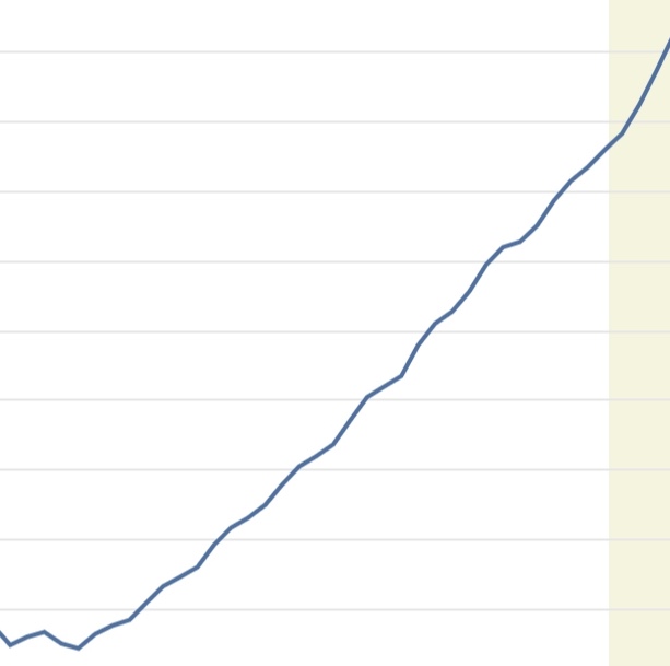
Pretty straightforward, right? Things were basically even, and then have been growing at a fairly steady rate since then.
(Yes, there’s no numbers or details. This could be about anything. That’s the point: focus on the story.)
Here’s another one I like:
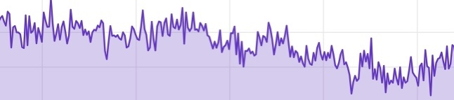
These are pretty easy, right? This one has a lot of fluctuation. But there does seem to be a slight downward trend.
Okay one more:
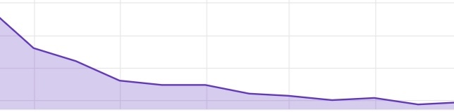
You get the idea. Whatever this is fell quickly but has leveled off. Ready for the point of this blog post?
The graph tells a story, but one point on the graph often tells a lie. When you hear things like “such-and-such figure is an all time high!” that may not mean anything. Maybe—like in the first graph—it’s something that generally increases. In fact any time you look at the current figure it’s always an all time high!
The same is the case for claims that “such-and-such is down” or “such-and-such is up.” Without context, a single data point is basically meaningless.
This is another way the lies come to us. So next time some politician screams about a particular number and blames it on the other side, ask about the context. Look it up. Find out the trend.
Because very, very often, it is a lie.
P.S. One of these is about five years of oil imports. Another is about 10 years of house prices. The last is one year of the unemployment rate.
P.P.S. Giving someone a whole graph can be a lie too, by deciding where to start and stop, adjusting the scale, etc.